Redesigning an Enterprise Intranet Around How Employees Work
Redesigned the BRConnect SharePoint intranet homepage by rethinking individual web parts, creating a clearer visual hierarchy, and supporting responsive implementation across devices and browsers.
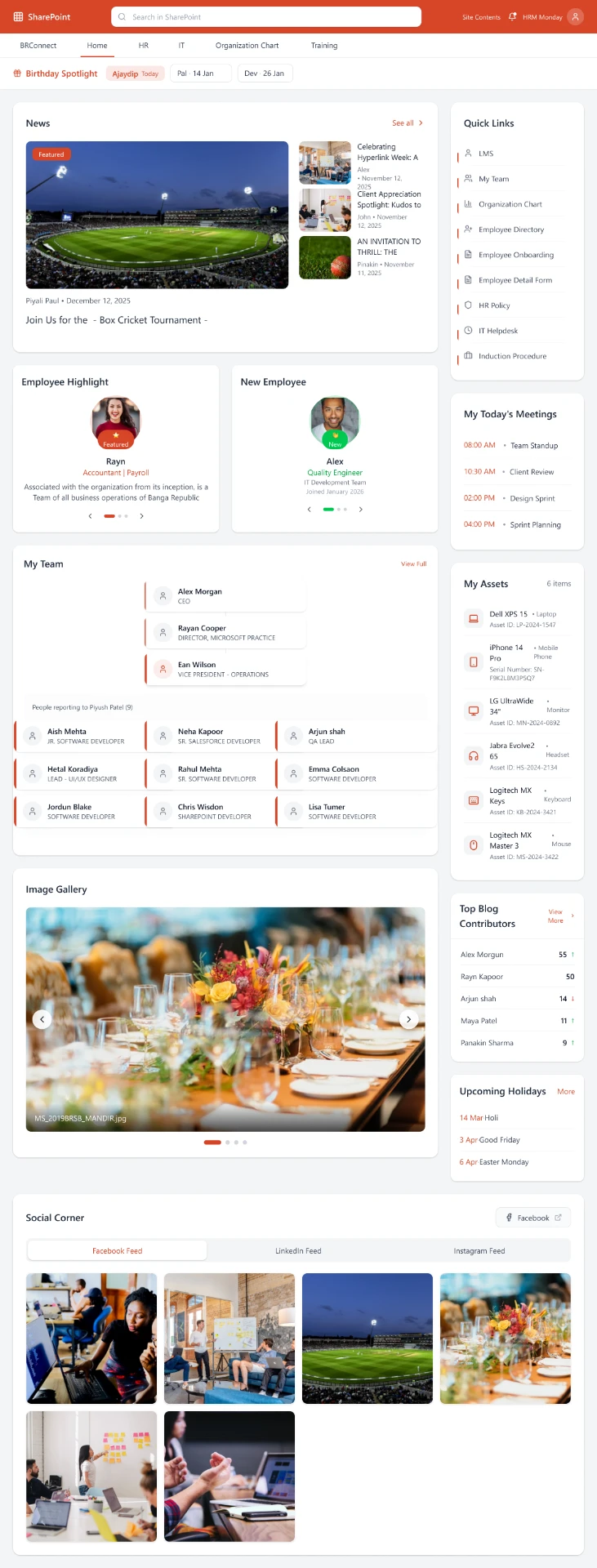
Redesigned BRConnect enterprise intranet homepage.
Project at a glance
Senior UI/UX Designer
BRConnect Intranet Redesign
SharePoint
Enterprise Intranet · Web Parts · Information Architecture · Responsive Design
Design · Development · SharePoint Implementation
Figma · Figma Make · SharePoint · AI-assisted design workflow
Redesign delivered and supported through implementation and responsive validation
An intranet that worked, but didn't feel like a cohesive employee experience.
The existing BRConnect intranet had functional content and web parts, but the overall experience had opportunities for improvement in visual hierarchy, layout consistency and presentation.
The challenge was to rethink the homepage as a connected employee experience rather than a collection of separate web parts.
Create a clearer, more connected workplace homepage.
Create stronger visual hierarchy so employees can quickly scan important information.
Design individual web parts with a more cohesive visual language.
Ensure the experience remains aligned and usable across different screen sizes and browsers.
Understanding the existing experience
I first reviewed the existing BRConnect experience to understand its structure, content areas and web-part patterns.
I also reviewed other digital workplace and intranet platforms to identify useful layout patterns, content hierarchy and ways of presenting employee-focused information.
Designing the experience one web part at a time
Rather than treating the homepage as one large interface, I broke the experience into individual web parts and refined each component around its purpose, content hierarchy and visual role within the broader intranet.
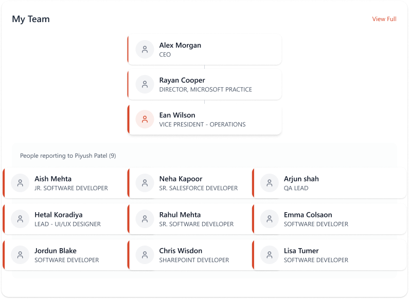
Structured team information to make reporting relationships and team members easier to scan.
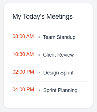
Presented upcoming meetings in a lightweight, time-focused format.
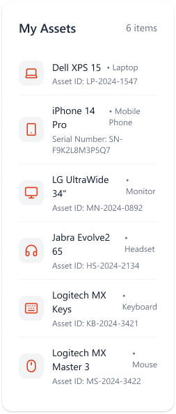
Listed assigned equipment in a scannable list with clear icons and supporting detail.
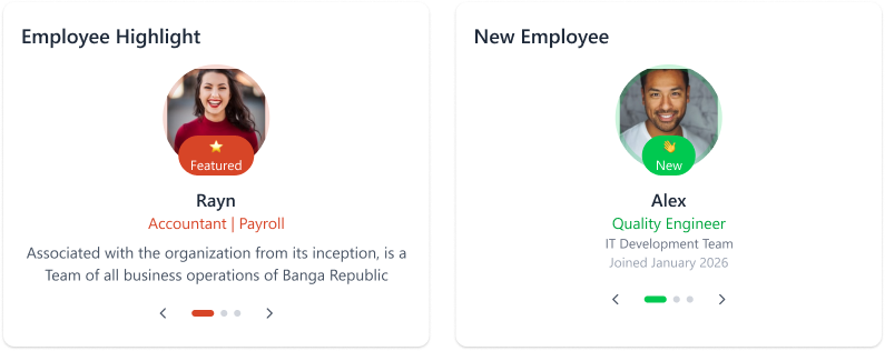
Gave people-focused content a consistent card treatment with clear roles and status.
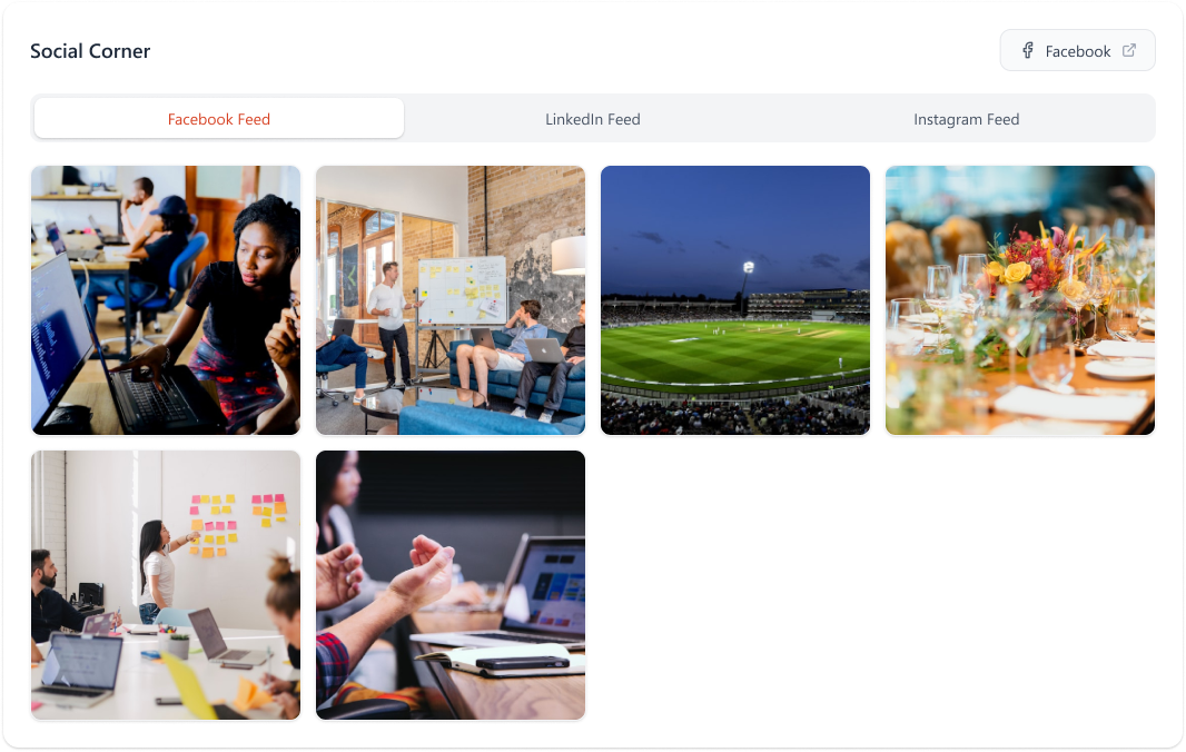
Unified social feeds behind a simple tabbed layout with a consistent media grid.
Bringing the web parts together into one cohesive homepage
After working through the individual web parts, I composed them into a structured homepage that balances primary content, employee utilities and supporting information.
Key design decisions
Give important employee information stronger visual prominence.
Create clear, reusable sections that can work together within the SharePoint homepage.
Use consistent spacing, cards, typography and interaction patterns across the experience.
From design to SharePoint implementation
I worked with the development team to communicate the web-part designs and layout requirements and supported the transition from design into the SharePoint implementation.
I reviewed implementation details and helped clarify visual and layout requirements as the experience moved from design into development.
Using AI to accelerate the design workflow
Figma Make and AI-assisted workflows helped accelerate layout exploration and iteration. The design decisions, information hierarchy and final experience remained guided by product and UX considerations.
Validating the experience across browsers and devices
After implementation, I reviewed the experience across different browsers and screen sizes to check alignment, spacing and responsive behavior.
I worked through visual inconsistencies identified during implementation and refined the experience to maintain a consistent layout.
From a collection of web parts to a more cohesive employee experience.
The redesign brought the BRConnect homepage together as a structured enterprise intranet experience, with clearer hierarchy, more consistent web-part patterns and a stronger visual system.
Beyond the visual redesign, the work supported the transition from design into SharePoint implementation and responsive validation.
What I learned
- Enterprise intranet design is as much about information hierarchy as visual design.
- Designing individual web parts systematically creates a more cohesive overall experience.
- A strong design needs to account for implementation constraints early.
- Responsive validation is essential when a design is implemented across enterprise environments.