From First Click to Consistent Growth
Rebuilding learner momentum through strategic UX design — a redesign of the Decoded DFC onboarding for an EdTech community.
Project at a glance
UX Researcher & Product Designer · Hackathon Team Project
15 days
Figma, Google Forms, PowerPoint
Learner Onboarding · Habit Formation · Retention & Engagement
🏆 Best Squad — DC Orbital Convergence Hackathon (EdTech Hyperinnovation category)
Research and redesign complete — proposed to the DFC founder, who responded positively and plans to implement it.
Motivated learners. A rhythm that broke.
Why excited learners lost momentum in the first weeks — five friction points from 220+ voices.
Many DFC learners joined with genuine excitement but struggled to maintain consistency, dropping off early in their learning journey. Five key issues drove this momentum breakdown.
Motivation faded fast
Excitement dropped sharply after the initial onboarding, leaving learners without a clear reason to return.
Information overload
A flood of resources with no structured path made it hard to know what to tackle next.
Unclear starting point
After signing up, users didn't know what to do first, so they stalled before they even began.
Invisible progress
Achievements and milestones were hidden, so learners couldn't see how far they'd come.
Isolation without support
Learners felt alone, lacking peer accountability or mentor guidance when motivation dipped.
The impact: lower engagement, reduced completion rates, and missed learning outcomes.
Mixed-method research with 220+ responses.
Research approach, key findings, ideation workshop, and analysis that shaped the redesign.
Our research combined four methods: in-depth interviews with 50+ learners to uncover friction points and emotional responses, 150+ telephone survey responses to quantify patterns in motivation and drop-off, 3 months of platform analytics to identify drop-off moments and engagement decay, and secondary research benchmarking against other EdTech platforms — altogether 220+ survey and call responses.
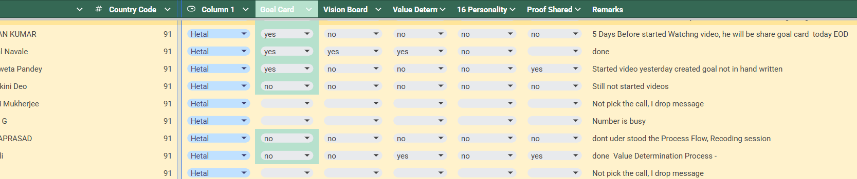
Interview planning and participant tracking used during primary research.
The data confirmed what learners had been telling us.
A Google Forms survey of 51 active DFC learners quantified the friction we heard in interviews. The signal was unambiguous — the roadmap wasn't landing, momentum wasn't forming, and the drop-off in week one wasn't a content problem.
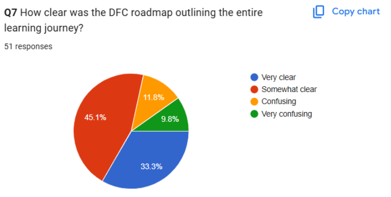
Combined “Somewhat clear,” “Confusing,” and “Very confusing” responses.
Learners weren't unmotivated. They were navigating blind — asked to commit weeks of effort without a visible path.
Momentum broke before a learning habit could form.
Interviews, telephone surveys, forms, and platform analytics — triangulated.
A momentum problem, not an acquisition problem.
I was excited to learn, but I didn't know where to start — and by week two, I stopped opening the app.
Learners didn't need more content. They needed structure — a visible path, small wins, and a sense of progress from day one.
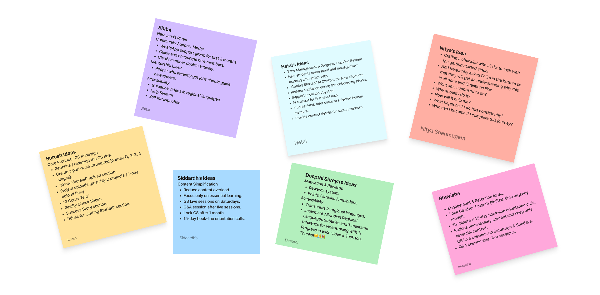
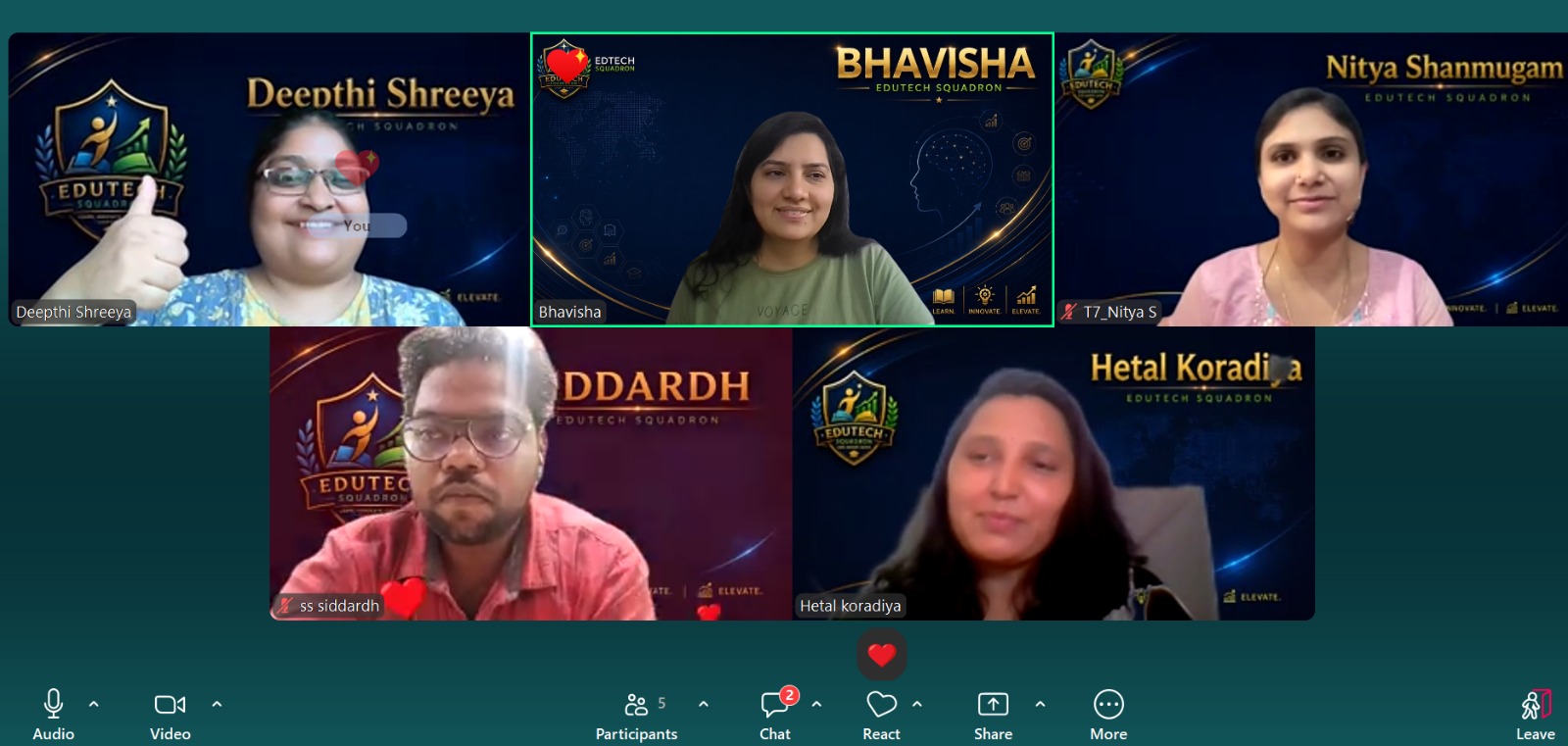
Five minds, one whiteboard, 40+ ideas.
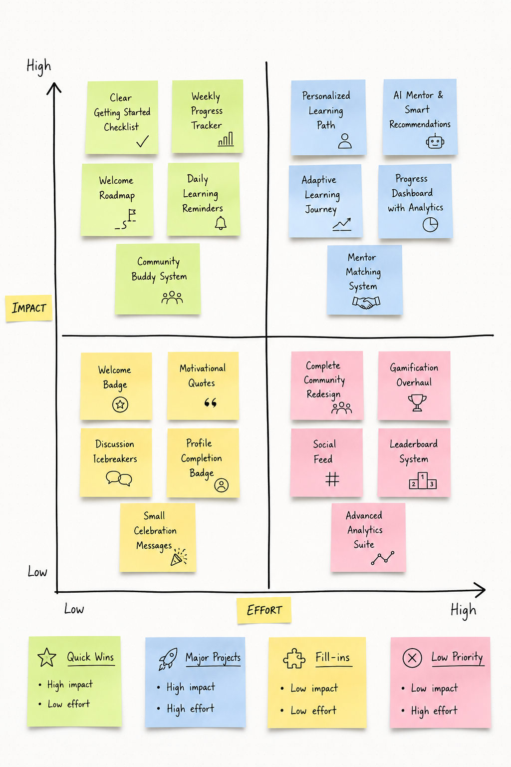
We ran a focused team ideation workshop — Crazy 8s, brainstorming, user personas, and an impact-vs-effort matrix — generating concepts across personalized onboarding, a goal-setting wizard, progress tracking, accountability groups, and mentor support.
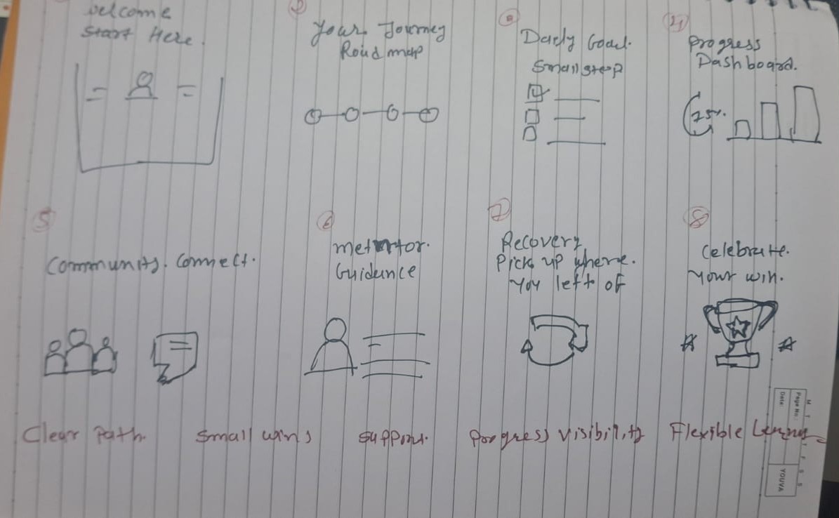
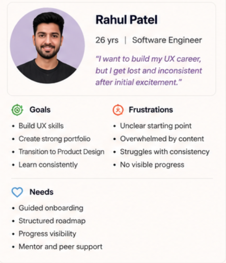
8 divergent sketches in 8 minutes — volume before judgment.
Grounded in the 220+ learner voices from research.
Reframed friction points into design opportunities.
Prioritized concepts by learner impact and build cost.
40+ raw concepts converged into five prioritized directions — the seeds of the redesigned onboarding journey.
From 40+ ideas to one behavioral change.
After the workshop, we pressure-tested every concept against learner evidence, reframed friction as opportunity, and narrowed the surface area to a single behavior worth changing.
Mapped 40+ ideas against learner pain points, effort, and impact — keeping only what solved a real motivation gap.
Rewrote each surviving concept as a How-Might-We — shifting from feature ideas to design opportunities.
Converged on one behavioral change: make the onboarding journey feel simple, structured, and achievable.
How might we help DFC learners stay consistent and emotionally connected during low-motivation and high-pressure phases?
A low-friction, milestone-driven journey.
Four design pillars and a proposed AI support flow that rebuild learner momentum.
We redesigned the learning journey into four sequential stages — each one designed to reduce overwhelm, build momentum, and give learners a visible sense of progress from day one.
To keep support timely and scalable, we also proposed an AI chatbot support flow that can answer common learner questions, nudge toward the next milestone, and route complex issues to mentors — extending the sense of guidance without overwhelming the team.
A short baseline assessment sets a clear starting point — no guessing where to begin.
Guided reflection maps strengths, gaps, and motivation — grounding learning in real goals.
A structured learning path with bite-sized modules, milestones, and streaks that build confidence.
Applied challenges validate progress and prepare learners for the community's harder work.
A path where every learner knows where they are, what's next, and why it matters — from the very first session.
Four pillars of the onboarding experience.
Designed to convert intent into momentum.
Meaningful outcomes from day one — every learner knows what success looks like.
Milestones, streaks, and achievements surfaced in a motivating dashboard.
Peer cohorts and mentor check-ins turn solo learning into shared momentum.
Short, achievable tasks that compound into confidence and consistency.
A momentum problem, not an acquisition one.
Expected impact of the redesign and the measured baseline it builds from.
Current retention funnel analysis showed an 18% total conversion rate, with the steepest drop-off occurring right at "Getting Started" — confirming this wasn't an acquisition problem (DFC successfully attracts motivated learners), but a momentum problem. Importantly, research showed many inactive users remained emotionally interested and recoverable — the gap was structure, not desire.
Forward-looking outcomes.
These are the projected effects we expect the redesign to create once live. They are intended as a directional hypothesis, not as measured results.
- More confidence in every session
- Clearer direction from day one
- Stronger week-over-week consistency
- Sustained motivation through visible progress
- Higher activation past the first session
- Increased mid-funnel retention
- Better course completion rates
- Compounding community growth
The measured starting point.
These are the real numbers the redesign is working from. They define the baseline, not the projected results.
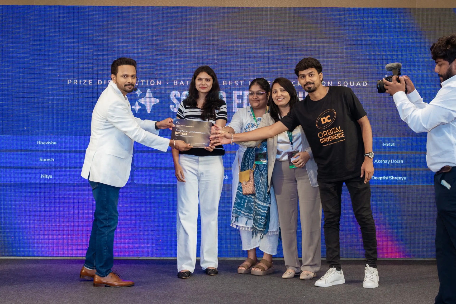
🏆 Best Squad — DC Orbital Convergence Hackathon, EdTech Hyperinnovation category.
Guided, supported, celebrated — not overwhelmed.
The mindset shift I carry into every product I design next.
Learning succeeds when users are guided, supported, and celebrated — not overwhelmed. The deeper lesson: people don't quit because they stop caring. They quit because they stop feeling forward motion. That principle now shapes how I approach every product I design — not just what a feature does, but whether it helps someone feel like they're getting somewhere.
Next steps: pilot the redesigned flow with a small cohort to validate the projected impact before full rollout, and build lightweight tracking from day one so real results can replace projected ones.