Making Investment Calculations Easier to Understand
Designing a financial distribution experience that simplified SIP investment calculations, investment reporting and portfolio performance for 10,000+ active users across mutual funds, insurance and investment products.
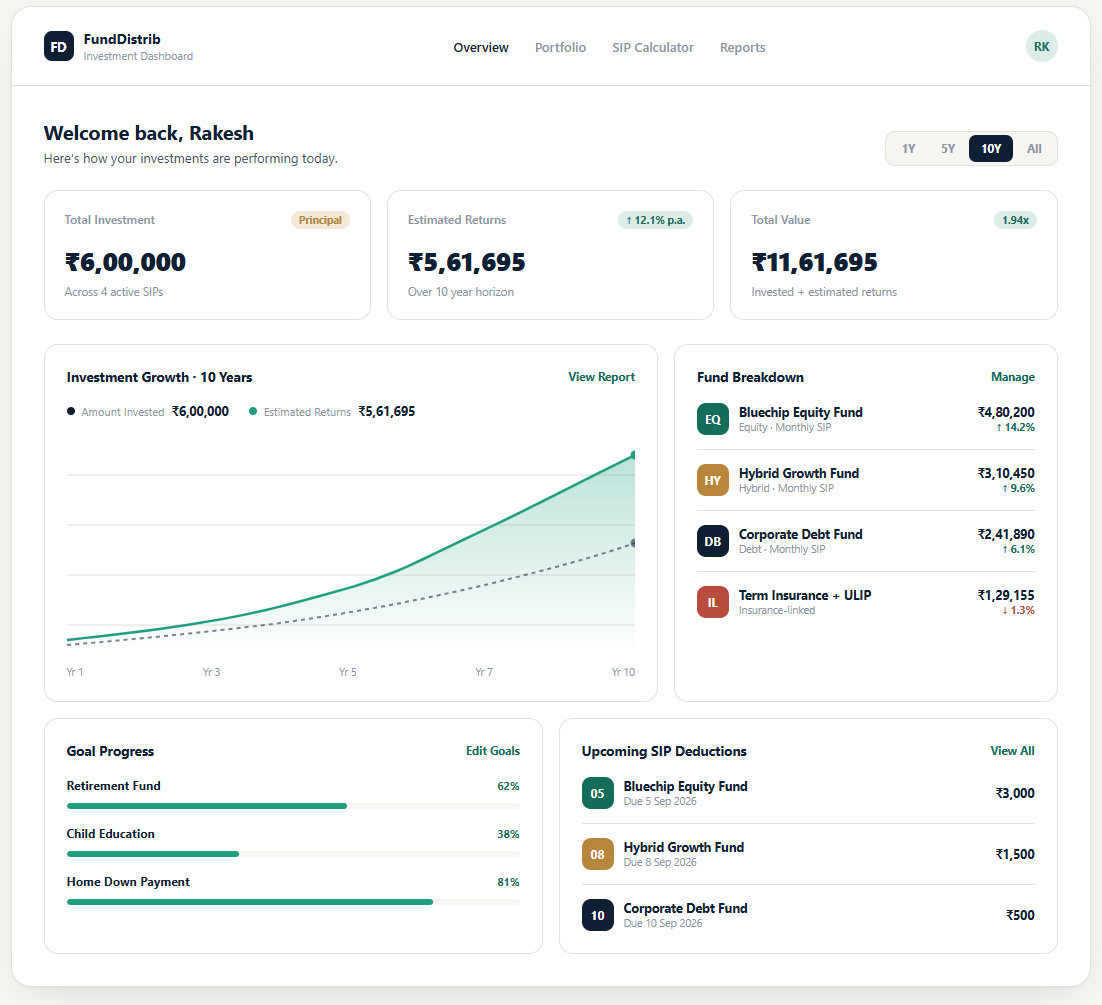
Reconstructed design exploration.
The Challenge
Distributors and end users needed a simple way to understand their investments — how much they were contributing, what it could grow into, and how it was performing over time. Mutual funds, insurance products and SIP contributions each came with their own calculation logic and terminology, and the existing experience left users doing mental math to connect an input (monthly amount, duration, expected return) to an outcome they could actually act on.
The challenge wasn’t building a calculator. It was making the relationship between investment amount, duration, expected return and final value legible to someone without a finance background, while still being precise enough for a distributor to trust professionally.
How might we make complex investment calculations easy to understand at a glance, without hiding the numbers that matter?
My Role
I worked across the experience end-to-end — from understanding the investment workflow and regulatory constraints, through structuring the information architecture, to designing the calculation flow, dashboard and reporting experience.
- Understood investment workflows, product types and role-based needs (distributor vs. administrator)
- Mapped the SIP calculation journey from input to outcome
- Structured the information architecture across calculation, summary and reporting
- Designed the SIP calculator interaction and input model
- Designed the investment dashboard and portfolio reporting views
- Defined the visual and interaction patterns reused across the platform
- Refined the complete flow from first input to final report
From Input to Understanding
The experience was structured around a simple mental model: Enter → Calculate → Understand → Review.
Investment goal, amount, frequency, duration, expected return
Real-time calculation as inputs change, no separate “submit” step
Investment summary broken into amount invested, estimated returns, total value
Ongoing dashboard and reporting for ongoing SIPs
Removing a separate calculate step mattered more than it sounds — early versions required users to fill in every field and press a button before seeing any result. Making the calculation live let users explore “what if I invest ₹2,000 more a month” the way they’d naturally think about the decision, instead of treating it like a form.
Designing the SIP Calculator
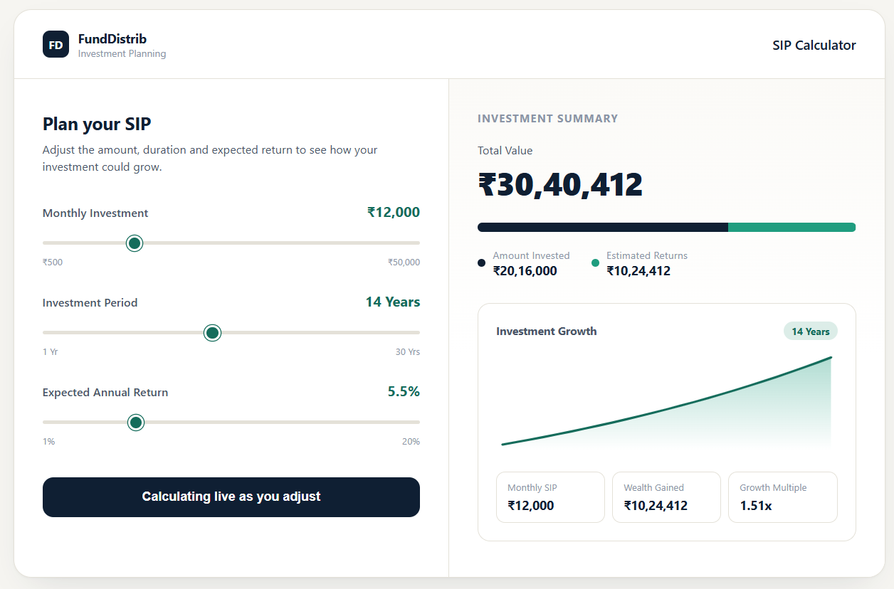
Reconstructed design exploration.
Three decisions shaped this screen:
Rather than a multi-step wizard, amount, duration and expected return sit on one screen with the summary alongside, so cause and effect are always in view.
Users don’t just need the final number — they need to see how it’s made up. Amount Invested and Estimated Returns are shown before Total Value, so the total isn’t a black box.
Terms like “expected annual return” and “investment period” replace internal calculation language, matching how a distributor would actually explain the product to a customer.
Investment Performance Dashboard
Reconstructed design exploration.
Once a SIP was active, users needed a way to check on it without re-running a calculation. The dashboard consolidates:
- Portfolio-level totals
Invested amount, estimated returns and total value at a glance.
- Growth over time
A visual trend rather than a static end number, so performance felt continuous rather than a one-time result.
- Fund-level breakdown
Most users held more than one SIP across equity, hybrid, debt and insurance-linked products, and needed to see how each was performing individually, not just in aggregate.
- Goal progress
Reframing performance against a personal goal (retirement, education, a home down payment) rather than only showing raw returns — closer to how people actually decide whether an investment is “working”.
Information Architecture
- Investment Amount
- Duration
- Expected Return
- Calculation
- Amount Invested
- Estimated Returns
- Total Value
- Portfolio Overview
- Fund Breakdown
- Goal Progress
- Investment Performance
Design Decisions
The most important financial numbers (total value, then the invested/returns split) get the strongest visual priority; supporting detail is deliberately quieter.
The primary calculation stays simple by default; fund-level and goal-level detail is available but doesn’t compete with the headline numbers.
Charts and summary bars replace dense tables wherever the goal was comprehension rather than audit — distributors still had access to full data views elsewhere in the platform for that purpose.
Mutual funds, insurance and investment products used the same input → calculate → summarize pattern, so learning one part of the platform transferred to the rest.
Impact
Simplified a genuinely multi-variable calculation (amount, frequency, duration, expected return, product type) into a single-screen, live-updating interaction that distributors could use directly with customers.
Created a clearer way for users to understand their invested amount, estimated returns and total investment value — not just the final number.
Established a foundation for presenting complex financial information through clearer dashboards, summaries and visual reporting across the platform.
Financial products are not only about accuracy — they are also about comprehension.
A calculation can be mathematically correct but still confusing if users don’t understand what the numbers mean.
This project shaped how I approach complex product problems today: understand the underlying workflow, simplify the information, and design the experience around how people actually make decisions.