From Wrong Answer to Comeback Plan
Helping Indian government exam aspirants stop repeating the same mistakes — an AI-powered mistake-repair system designed and prototyped over a 60-day hackathon.
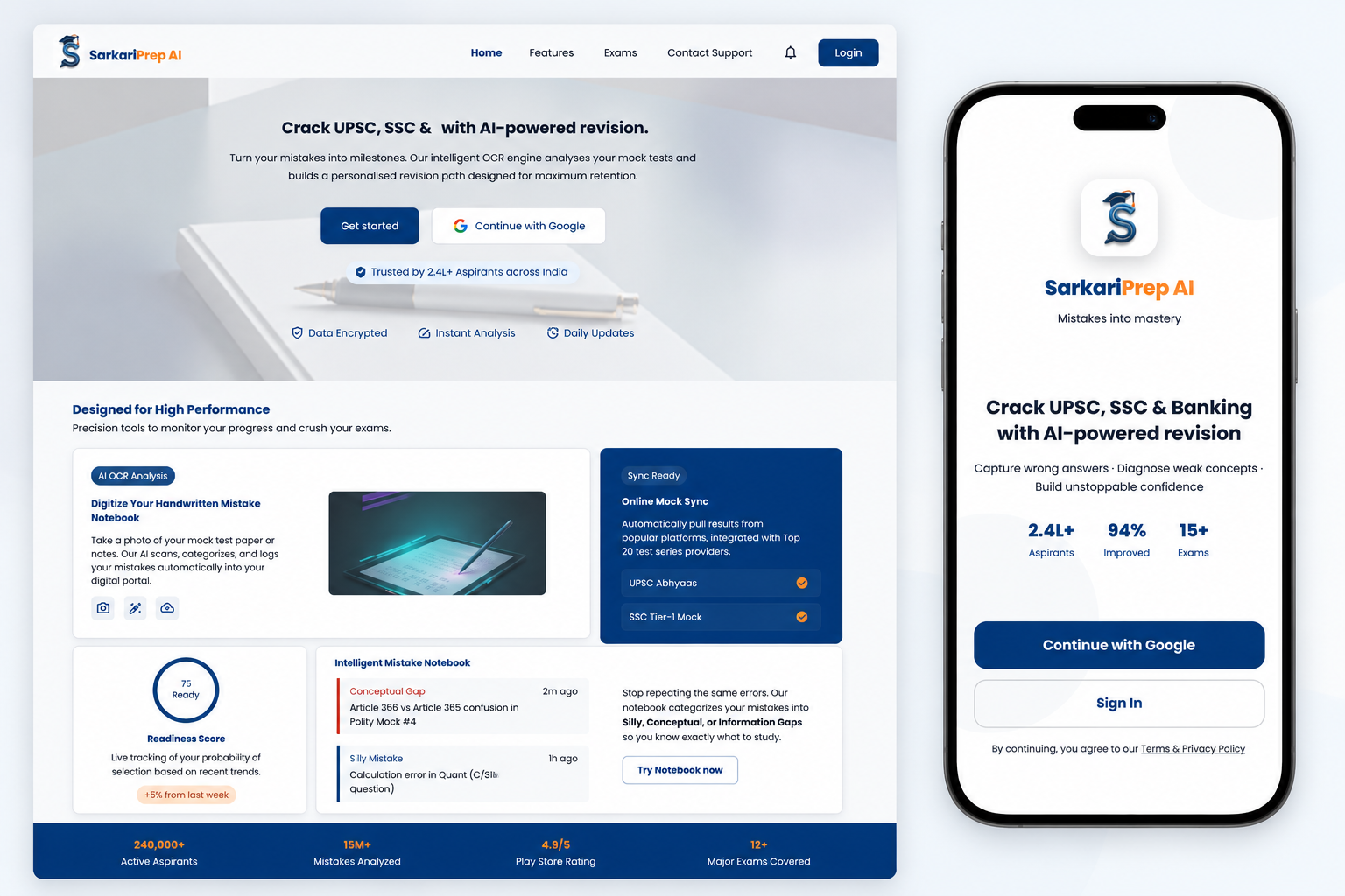
Project at a glance
UX Researcher & Vice Captain · Hackathon Team Project
60 days
Figma, Google Forms, user interviews
EdTech · AI-Assisted Learning · Mistake-Repair UX · Accessibility
Research and high-fidelity prototype complete (mobile + web) — expert accessibility review folded into the process
Why do thousands of hours of preparation still fail to improve exam performance?
Millions of Indian government exam aspirants study consistently, solve mock tests, and consume endless learning content. Yet many continue repeating the same mistakes because they lack a structured way to diagnose weak concepts, understand why mistakes happen, revise efficiently, and measure real improvement over time.
This isn't a content problem — it's a learning repair problem.

Students aren't failing because they lack resources — they're failing because they lack a structured feedback loop that transforms mistakes into measurable improvement.
How research evolved into a structured AI learning repair system.
Instead of starting with screens, I followed a structured product design process to understand why government exam aspirants struggle to improve. Every activity informed the next design decision, resulting in a focused learning repair system rather than another content app.
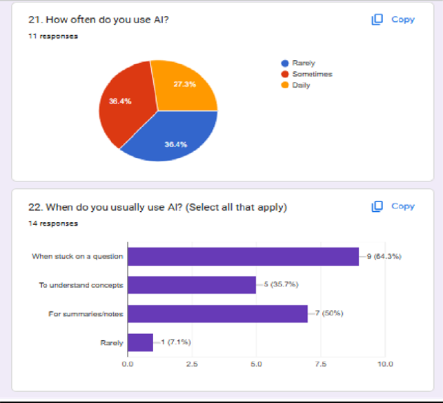
Understanding Aspirants
To validate assumptions, I combined quantitative and qualitative research.
- Survey with 14 government exam aspirants
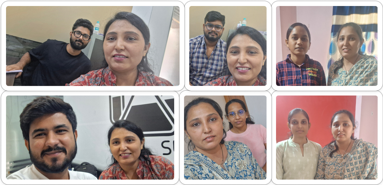
- One-to-one interviews
- Behaviour analysis
- Secondary research
- AI usage patterns
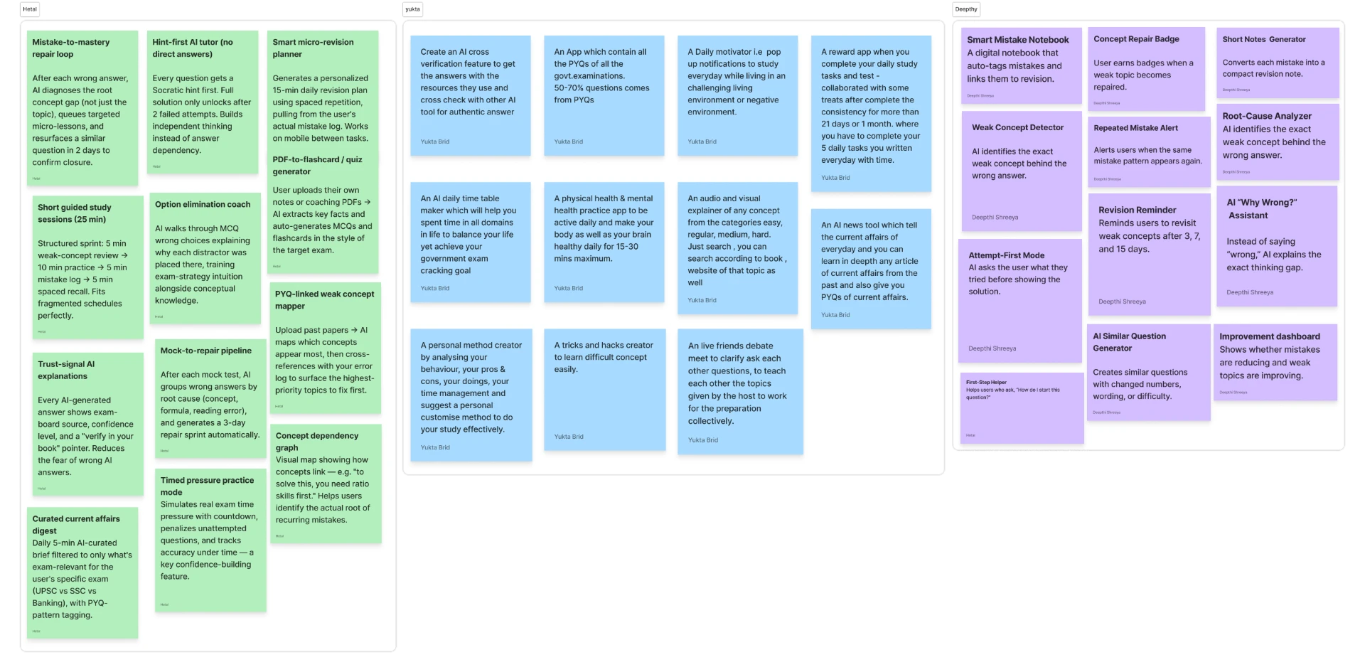
Finding Patterns
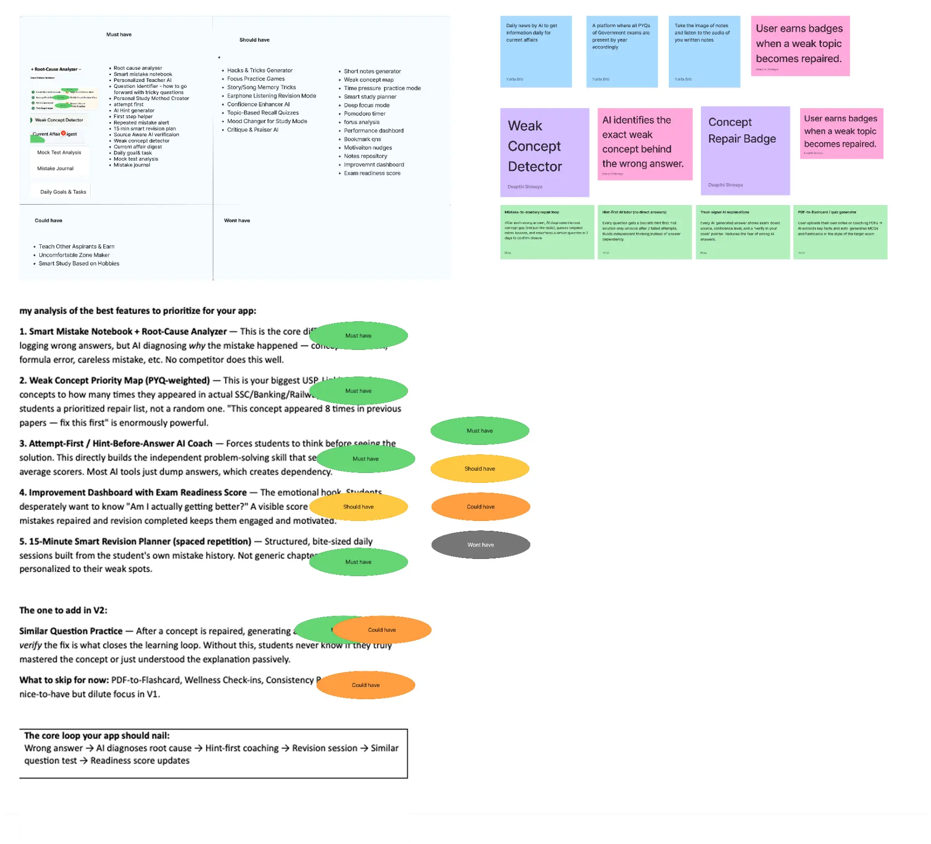
After collecting research, I synthesized insights using Affinity Mapping. This helped uncover recurring behavioural patterns rather than isolated problems.
- Students rely on AI for answers rather than learning.
- Weak concepts remain unidentified.
- Revision is inconsistent.
- Progress is difficult to measure.
Prioritizing the MVP
Not every feature deserved to be part of Version 1. Using the MoSCoW framework, I focused on the smallest feature set that could solve the core learning problem.
- Root Cause Analyzer
- Weak Concept Detector
- Smart Mistake Notebook
- AI Hint-first Learning
- Personalized Revision
- Dashboard
- Planner
- Gamification
- Community
Focusing on fewer, high-impact features prevented feature overload.
Designing the Learning Journey
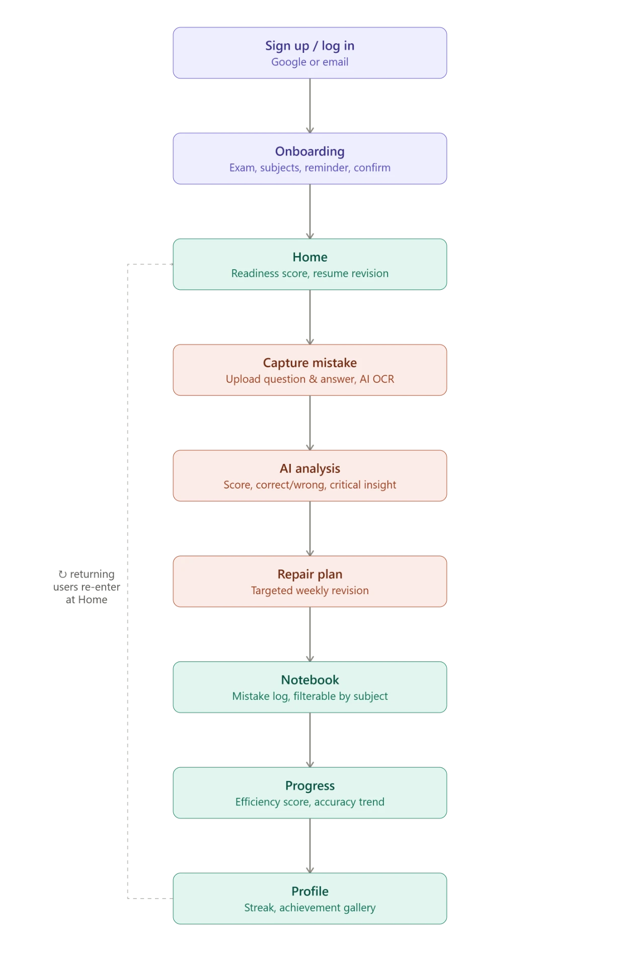
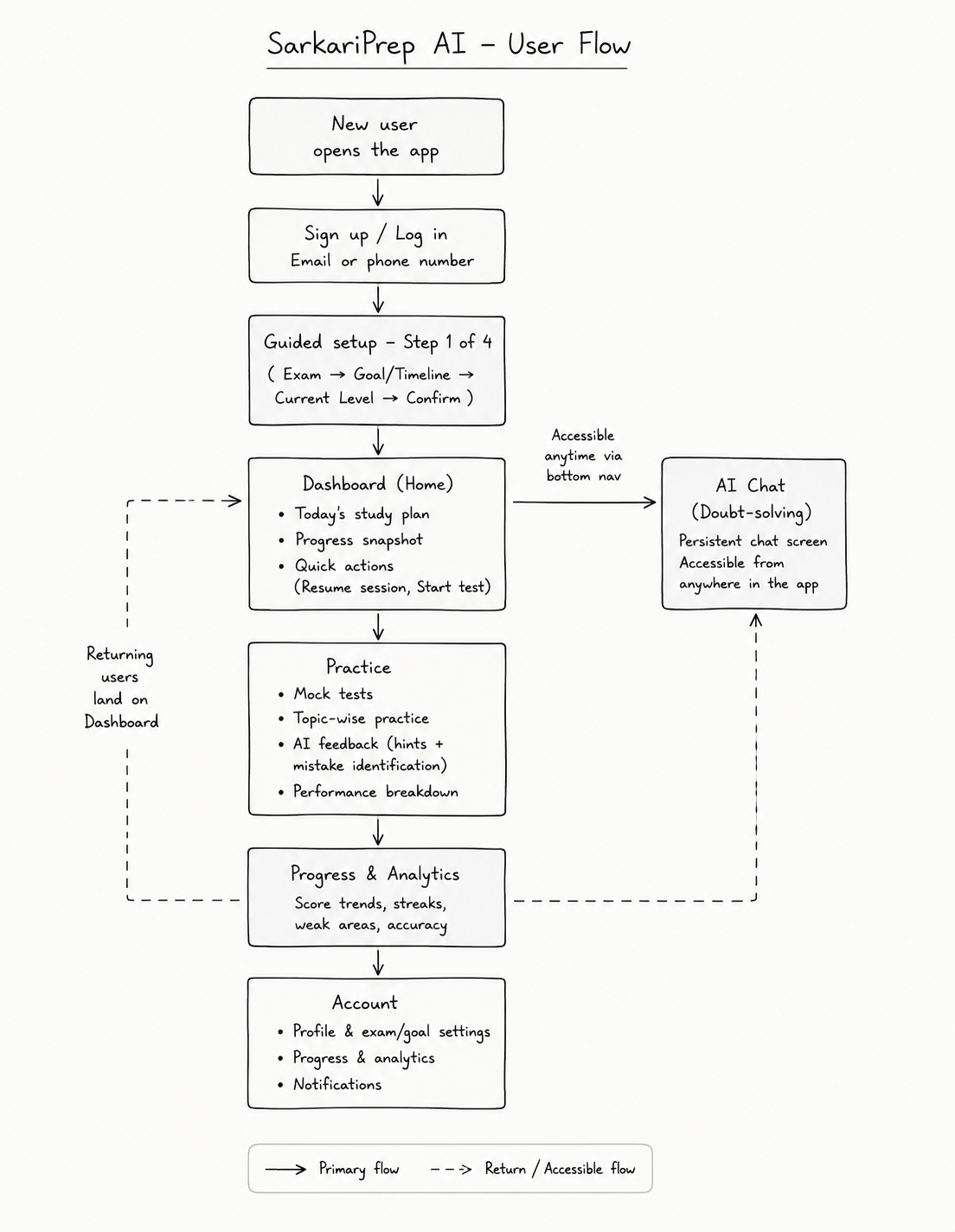
Instead of isolated screens, the product was designed as one continuous learning loop.
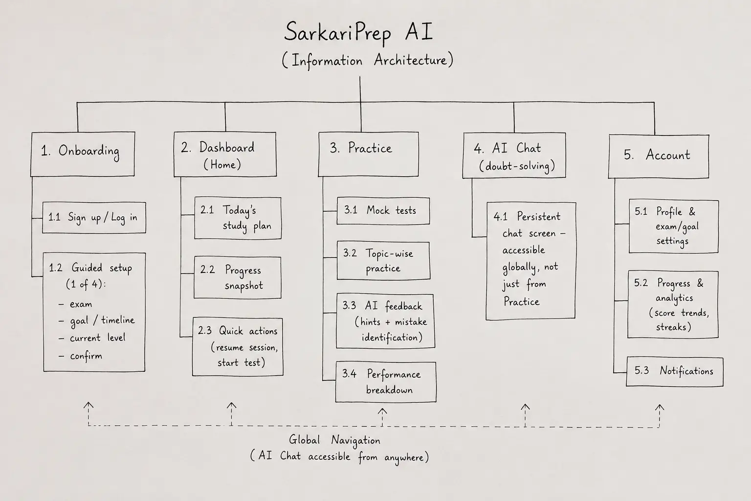
Structuring the Product
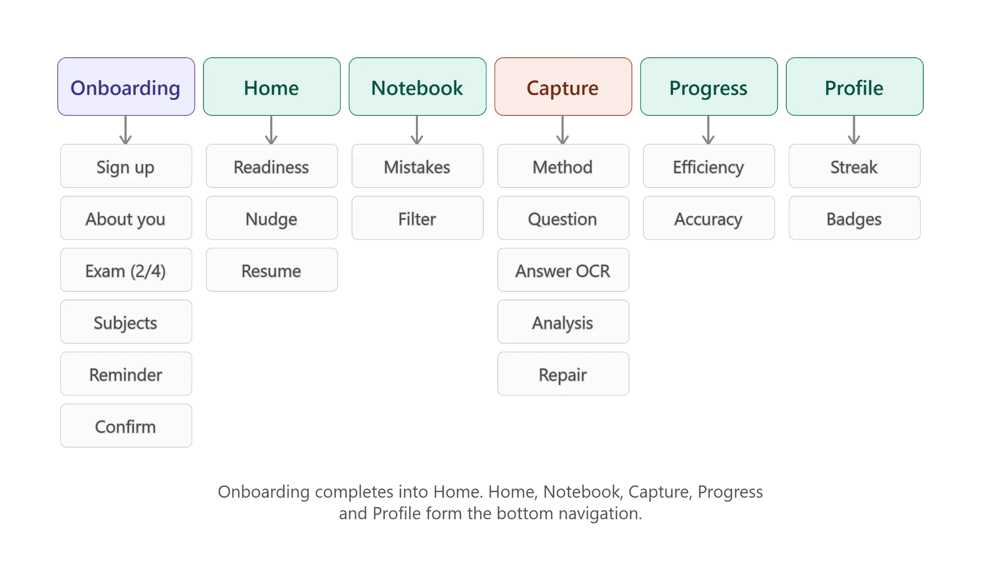
The information architecture organized every feature into six learning stages.
Students always know what to do next.
Collaborative Workshops
Cross-functional brainstorming sessions helped validate ideas before moving into detailed design.
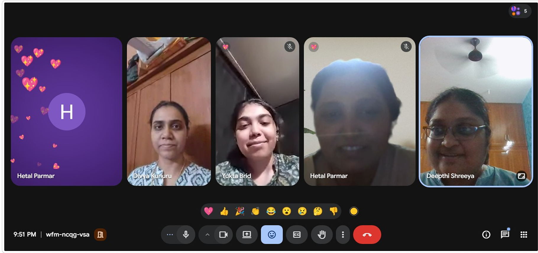
Research, synthesis, prioritization, user flows, and collaborative ideation transformed a broad AI learning concept into a focused product that helps students diagnose mistakes, repair weak concepts, and measure real improvement.
An 8-step repair loop, not another content app.
We designed the MVP around one flow: Upload → Detect → Diagnose → Prioritize → Repair → Practice → Save → Track.
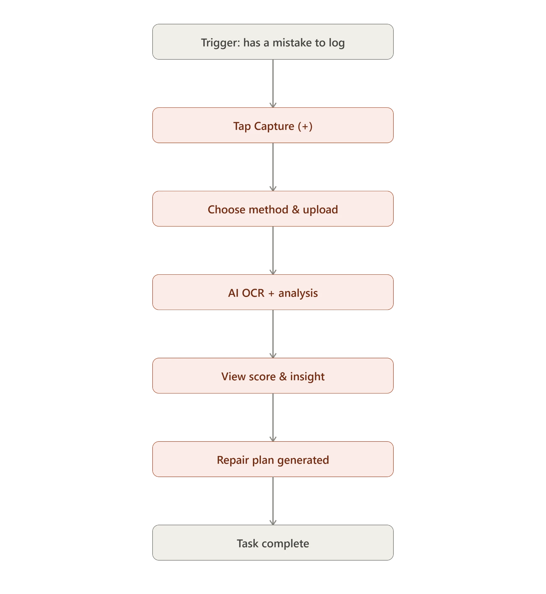
Instead of entering mistakes one at a time, users upload a full mock-test paper or solution sheet. The system detects every mistake automatically, groups them by weak concept, explains the root cause behind each one (wrong formula, misread question, time pressure — not just "wrong"), ranks what to fix first, and builds a 15-minute repair plan — concept refresh, worked example, and similar practice questions — before saving everything to a Smart Mistake Notebook and updating an Exam Readiness Dashboard.
- Not just answers — diagnosis.
- Not just mocks — mistake repair.
- Not just progress charts — a readiness score.
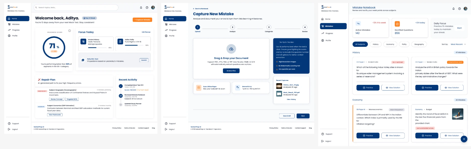
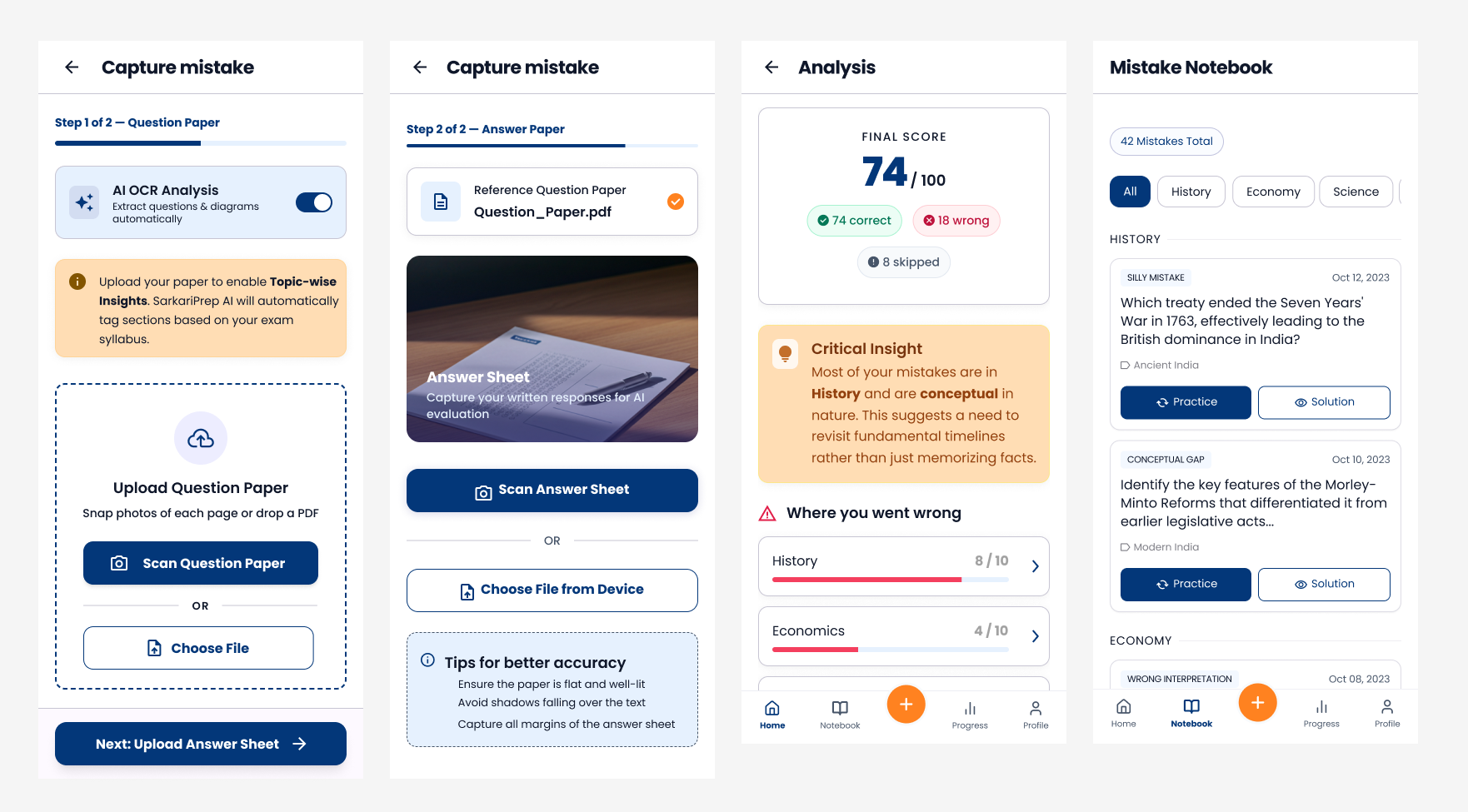
An accessibility review that clarified, not compromised.
A 1:1 expert accessibility review tested navigation through the upload → diagnosis → repair flow and surfaced three changes: visible back/skip options on every screen so users never feel trapped mid-flow, a color palette pared down to 2-3 purposeful colors instead of competing for attention, and fewer options at each entry point so users see one clear next step instead of five at once.
Expected impact
clearer diagnosis of weak concepts, a structured revision loop instead of scattered studying, visible evidence of improvement
validated a differentiated position against content-heavy competitors, an accessibility-tested flow ready for further usability testing
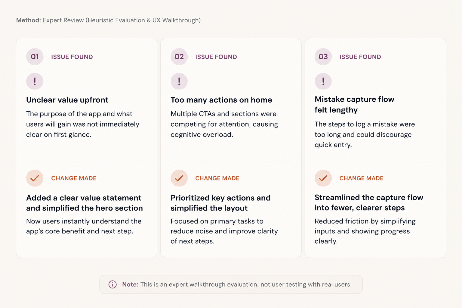
The learning: simplifying didn't reduce functionality — it clarified the product's core value.
Diagnosis is the entry point. Repair is the value.
Early concepts focused on detecting mistakes with perfect accuracy. Research showed aspirants cared more about fixing mistakes than confirming they existed — that shifted the whole product: diagnosis became the entry point, repair became the point.
Next steps: moderated usability testing with actual aspirants on the high-fidelity prototype, and validating the hint-first interaction model (hints before answers) against a direct-answer alternative to confirm which actually drives faster learning.
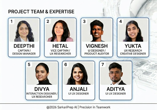
My role: UX research and product design.